welcome to mies and peas!

your nonstop source of everything science of architecture, including information for the ARE, LEED, and PE exams.
Showing posts with label France. Show all posts

Monday, September 26, 2011

MIES - Maison de l'Architecture


The Maison de l'Architecture at Daytime

The is a competition entry of an center of architecture designed by Nadau Lavergne Architects in Bordeaux, France.  The design is inherently simple: two oblong boxes are set afloat with vertical transitions (escalators, stairways) connecting them.  Staggered engineered trusses are employed to support the individual floors and long span beams made out of hollow steel tubing support the ceiling for an auditorium on the topmost floor.


Longitudinal Section of the Center

The section/model was constructed to convey a sense of linearity.  Situated near the Seine, the center of architecture would provide as a landmark to the beginning of the urban sector in Paris.  Porous and oxidized metal cladding would block out the unwanted rays reflecting off the water's edge and a buffer of green delineates the entry point to the facility from the metropolitan corner.


Vertical Circulation via Escalators


The Auditorium Lit Up

Atrium and auditorium spaces are set apart to accentuate themselves in the evening.  Floor and ceiling lights are set within parts of the structures (such as the staircases) to enhance the overall ambience of the structure.  Colors are set at a minimum, but silver and gold accents are abundantly clear in this early schematic design.


The Atrium


Proposed Staggered Truss Structural System 

For an unwieldy structure, the staggered truss makes sense.  Braced by steel tubes in the original design, in actuality, this may better be braced by a system of chevron braces between floors (which would retain the minimal structure while economically functioning as a conduit for lateral loads.


The Finished Structure at Night

Lastly, a rendering at night emphasizes what the design is all about: standing out.  This is not a design of a building.  Rather, it is the design of a space.  The space boldly separates itself from the built environments as the cars pace by.  It declares, rather than fits in.  Whether that's desirable or not is for the people of Bordeaux to decide.

Thursday, September 22, 2011

MIES - Palais Garnier


Atop the Palais Garnier at Sunrise

Oh, what it must have been like to be a fly on the wall in nineteenth-century Paris.  The height of opera, the height of the Ecole des Beaux Arts, the arrival of cuisine and the stylings of a new world order.  Things for the bourgeois were pretty damn good then.  Literary colossuses such as Hugo, Flaubert, Dumas, Zola and others patterned themselves saviors of a wicked age, true, but what a wicked age it was...

This is perhaps the masterstroke of all Beaux-Arts architectural accomplishments: the Palais Garnier.  Built by Charles Garnier in 1875 and fashioned to be Neo-Baroque in style and appearance, what the Eiffel Tower is to steel structures the Palais Garnier is to lavishness altogether.

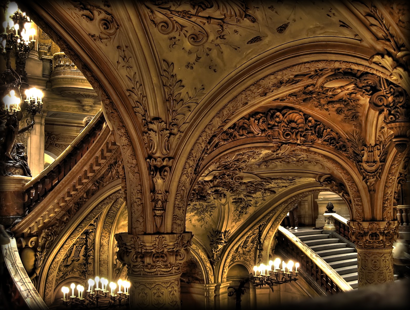
Just look at it.  The gold lighting.  The coupled pilasters and the exquisite acumen for detail.  The marble staircase.  Thousands of chandeliers and candelabras.  It is a feat we could not accomplish today even with the money we spend on our buildings.  It is a code-defying declaration of national pride and unlike modern spaces - which trumpet simplicity for simplicity's sake - the simplicity here is in the arrangement and promenade.  Grand foyer, grand staircase, regal corridors, box seating, lights, camera, action!


The Grand Staircase

A little history: the Palais Garnier is a building of exceptional opulence. It seats an audience of about 2,200 under a central chandelier which weighs more than six tons, and has a huge stage with room to accommodate as many as 450 artists. The style is monumental and considered typically Beaux-Arts or Neo-Baroque, with use of axial symmetry in plan, and its exterior ornamentation.


The Facade at Night

The Palais is decorated opulently with elaborate multicolored marble friezes, columns, and lavish statuary, many of which portray deities of Greek mythology. Between the columns of the theatre's front façade, there are bronze busts of many of the great composers, Mozart, Rossini, Daniel Auber, Beethoven, Meyerbeer, Fromental Halévy, Spontini, and Philippe Quinault. The interior consists of interweaving corridors, stairwells, alcoves and landings allowing the movement of large numbers of people and space for socializing during intermission. Rich with velvet, gold leaf, and cherubim and nymphs, the interior is characteristic of Baroque sumptuousness.


Chandeliers Reflecting off the Foyer Floors


The Beginnings of Organic Architecture

One can notice, if they look closely, the inspiration of other famous buildings such as the Guarantee Building in Buffalo, New York by Louis Sullivan.  There is a depth in organic/floral detailing here that implies a growing away from classical roots to a more modern world.  And yet, this is a building that retains aspects of both schools of thought.  It is not simple, yet is simple in design.  And its ornamentation, while sumptuous, seems appropriate for its day in age.  The Palais Garnier contradicts, inspires, emboldens and declares to all who experience it.  It is simply a force of work.

Tuesday, September 13, 2011

MIES - Spatial Anisotropy


The following is a design from Odile Decq Benoît Cornette Architects in France. It is the VNF-Headquarters competition for a modern Parisian building, and it uses the Seine River to ultimate affect. Also defined by the firm is the concept of "spatial anisotropy." As a structural engineer, I understand what that means - that the material, like wood, doesn't have a similar grain pattern in different directions. In other words, the spaces aren't the same going east, west, south, north, up, down, et cetera.


Here is Odile Decq Benoît Cornette's description of their unique design: "Spatial anisotropy dilates, tightens, conducts and wraps. Fluid and continuous, a ribbon of metal is inlaid with glass surfaces and draws successively a volume in relief, a volume in a hollow tangentially connected."

Their design begins by forming the atrium which hosts the exhibition space and the entrance hall. The atrium distributed offices on two levels. The ribbon continues its race around the volume in relief and becomes the external skin of the offices. And then it spreads around the volume in a hollow of the cultural space, great plan free (200 m) open on a terrace (150 m). Whatever the use of this second barge, the configuration of spaces, and the mode of junction allows to link or to separate the two entities. The two barges are connected and linked to the wharf by two gateways whose one continues to walk at the edge of the water by following the curve of the volume in a hollow.


The 'ribbon' is a skin indoor and outdoor composed of metal pixels of glass offering different views of the Seine and the docks. The spatial anisotropy is truly a dilation space forming a revulsion and a spatial contraction. When there is interaction there is transformation of the local geometry.

Overall, this is a sheik design using historic landmarks (such as the Seine) to augment a more modern design successfully. The material choice, also, would be interesting to specify. One feels that Frank Gehry might know a thing or two about potential manufacturers of the cladding.