Building Facade of the American Folk Art Museum
Although the American Folk Art Museum has avoided dissolution thanks to a cash infusion from trustees and the Ford Foundation, the institution’s ongoing financial troubles raise difficult questions about the relationship between signature architecture and cultural capital. The museum’s former home on 53rd Street opened in 2001 after a renovation by Billie Tsien and Tod Williams. To finance the construction, the museum borrowed $32 million by issuing bonds through the city’s Trust for Cultural Resources, a public benefit corporation that helps cultural institutions borrow money for capital projects. The payments on the bonds were significant, about $3 million a year, and in 2009, the museum defaulted on the debt. Despite early optimism, the American Folk Art Museum’s renovation project did not raise attendance or donations to the levels needed. Last year, as it ran a nearly $4 million deficit, the museum raised just $3.3 million from donors. As we reported in May, the museum was forced to sell its building on West 53rd Street to the Museum of Modern Art to pay off the debt. Before opening, consultants predicted the building would draw 255,000 visitors a year by 2005. In 2011, the museum only attracted the equivalent of 160,000 per year.
Like many other museums, the American Folk Art Museum saw capital improvement as a means for bolstering public awareness and philanthropic revenue. The last two decades has witnessed a dramatic increase in such projects, with Frank Gehry’s design for the Museo Guggenheim Bilbao probably the most notable in a category which also includes the Milwaukee Museum of Art (Santiago Calatrava, 2001), and the ICA/Boston (Diller Scofidio + Renfro, 2006). These projects, wherein signature architecture is essentially used as collateral for outside financing, differ from other iconic projects such as The Getty Center (Richard Meier, 1997), Islamic Art Museum, Doha (I.M. Pei, 2008), or the ongoing expansion of LACMA (Renzo Piano and Peter Zumthor), which were well-funded before construction.
So unfortunately, the American Folk Art Museum serves as a potent reminder of the risk associated with architectural investment. But since it is an elaborate work of art, this is a recapitulation of why it remains, even after the financial woes, a significant piece of architecture:
Completed by architects Tod Williams and Billie Tsien in 2001 the museum is 40 feet wide and 100 feet long and is surrounded by the Museum of Modern Art on three sides. It was the first new museum built in New York in over three decades. It is one of the more sensual exhibits to date, as is evidenced by the radical but subdued facade.
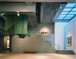
Concrete Stairwell and Exhibition Space
Eight levels tall on 53rd Street, the American Folk Art Museum welcomes visitors with a grand two story atrium. The mezzanine above, which has a small cafe, looks over the atrium as well as 53rd Street. The four upper floors contain the gallery spaces for permanent and temporary exhibitions. Due to zoning codes and the extensive program for the site, the building also had to extend two levels underground to hold the auditorium, classrooms, museum offices, a library, and archives.
Metal Railings and Asphalt Concrete Landing
The art is located along the path of circulation through the building, such as along staircases, allowing visitors to walk from floor to floor viewing art being displayed. These paths sometimes break off into small nooks which provide space for permanent collections. A skylight between the second and third floors above the grand staircase allows light to enter the gallery spaces.
Viewing the Stairwell from Underneath; Gallery Space Continued
The Lobby as Seen Upon Entry
A Clear Division in Spaces
First Floor
Gallery Floor


No comments:
Post a Comment