welcome to mies and peas!

your nonstop source of everything science of architecture, including information for the ARE, LEED, and PE exams.

Wednesday, September 28, 2011

MIES - Folk Art Museum


Building Facade of the American Folk Art Museum

Although the American Folk Art Museum has avoided dissolution thanks to a cash infusion from trustees and the Ford Foundation, the institution’s ongoing financial troubles raise difficult questions about the relationship between signature architecture and cultural capital. The museum’s former home on 53rd Street opened in 2001 after a renovation by Billie Tsien and Tod Williams. To finance the construction, the museum borrowed $32 million by issuing bonds through the city’s Trust for Cultural Resources, a public benefit corporation that helps cultural institutions borrow money for capital projects. The payments on the bonds were significant, about $3 million a year, and in 2009, the museum defaulted on the debt. Despite early optimism, the American Folk Art Museum’s renovation project did not raise attendance or donations to the levels needed. Last year, as it ran a nearly $4 million deficit, the museum raised just $3.3 million from donors. As we reported in May, the museum was forced to sell its building on West 53rd Street to the Museum of Modern Art to pay off the debt. Before opening, consultants predicted the building would draw 255,000 visitors a year by 2005. In 2011, the museum only attracted the equivalent of 160,000 per year.

Like many other museums, the American Folk Art Museum saw capital improvement as a means for bolstering public awareness and philanthropic revenue. The last two decades has witnessed a dramatic increase in such projects, with Frank Gehry’s design for the Museo Guggenheim Bilbao probably the most notable in a category which also includes the Milwaukee Museum of Art (Santiago Calatrava, 2001), and the ICA/Boston (Diller Scofidio + Renfro, 2006). These projects, wherein signature architecture is essentially used as collateral for outside financing, differ from other iconic projects such as The Getty Center (Richard Meier, 1997), Islamic Art Museum, Doha (I.M. Pei, 2008), or the ongoing expansion of LACMA (Renzo Piano and Peter Zumthor), which were well-funded before construction.

So unfortunately, the American Folk Art Museum serves as a potent reminder of the risk associated with architectural investment. But since it is an elaborate work of art, this is a recapitulation of why it remains, even after the financial woes, a significant piece of architecture:

Completed by architects Tod Williams and Billie Tsien in 2001 the museum is 40 feet wide and 100 feet long and is surrounded by the Museum of Modern Art on three sides. It was the first new museum built in New York in over three decades. It is one of the more sensual exhibits to date, as is evidenced by the radical but subdued facade.


Concrete Stairwell and Exhibition Space

Eight levels tall on 53rd Street, the American Folk Art Museum welcomes visitors with a grand two story atrium. The mezzanine above, which has a small cafe, looks over the atrium as well as 53rd Street. The four upper floors contain the gallery spaces for permanent and temporary exhibitions. Due to zoning codes and the extensive program for the site, the building also had to extend two levels underground to hold the auditorium, classrooms, museum offices, a library, and archives.


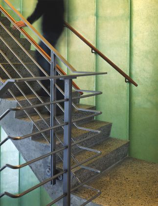
Metal Railings and Asphalt Concrete Landing

The art is located along the path of circulation through the building, such as along staircases, allowing visitors to walk from floor to floor viewing art being displayed. These paths sometimes break off into small nooks which provide space for permanent collections. A skylight between the second and third floors above the grand staircase allows light to enter the gallery spaces.


Viewing the Stairwell from Underneath; Gallery Space Continued

Much of the flooring is terrazo ground concrete linking to the walls which are concrete as well. The flooring for the gallery juxtaposes the cold feeling of concrete with Ruby Lake Fir Logs, providing a much warmer and welcoming environment.


The Lobby as Seen Upon Entry

The exterior of the museum is a sculpture itself, intended to represent an abstracted open hand. Cladded in tombasil metal panels consisting of white bronze with 57% copper, its texture came from casting the panels from sand molds taken from the texture of concrete. The movement of the panels as they fold inwards responds to the sunrise, sunset, and changing of the seasons, its glow depending on the natural sunlight of each day. Selected as the ”Best New Building in the World in 2001,” the museum is a work of art for visitors and pedestrians to admire, and in the words of the architects themselves it is “an idiosyncratic home for idiosyncratic art.”


A Clear Division in Spaces


First Floor


Gallery Floor

Monday, September 26, 2011

MIES - Maison de l'Architecture


The Maison de l'Architecture at Daytime

The is a competition entry of an center of architecture designed by Nadau Lavergne Architects in Bordeaux, France.  The design is inherently simple: two oblong boxes are set afloat with vertical transitions (escalators, stairways) connecting them.  Staggered engineered trusses are employed to support the individual floors and long span beams made out of hollow steel tubing support the ceiling for an auditorium on the topmost floor.


Longitudinal Section of the Center

The section/model was constructed to convey a sense of linearity.  Situated near the Seine, the center of architecture would provide as a landmark to the beginning of the urban sector in Paris.  Porous and oxidized metal cladding would block out the unwanted rays reflecting off the water's edge and a buffer of green delineates the entry point to the facility from the metropolitan corner.


Vertical Circulation via Escalators


The Auditorium Lit Up

Atrium and auditorium spaces are set apart to accentuate themselves in the evening.  Floor and ceiling lights are set within parts of the structures (such as the staircases) to enhance the overall ambience of the structure.  Colors are set at a minimum, but silver and gold accents are abundantly clear in this early schematic design.


The Atrium


Proposed Staggered Truss Structural System 

For an unwieldy structure, the staggered truss makes sense.  Braced by steel tubes in the original design, in actuality, this may better be braced by a system of chevron braces between floors (which would retain the minimal structure while economically functioning as a conduit for lateral loads.


The Finished Structure at Night

Lastly, a rendering at night emphasizes what the design is all about: standing out.  This is not a design of a building.  Rather, it is the design of a space.  The space boldly separates itself from the built environments as the cars pace by.  It declares, rather than fits in.  Whether that's desirable or not is for the people of Bordeaux to decide.

MIES - Medical Clinic


The Lounge at Cella Medical Clinic

(Via Archinect) This design reflects the hospital's specialty, “personalized cell therapy”- a new technology of transplanting skin cells enriched from adult cell therapy. Metropolitan United States, PLLC (MUS for short) approached the design of the clinic holistically, much like the way a physician would treat a patient’s body as a whole. Thus, the overall design is a fluid expression of the human cell and its connective systems. Layers of undulating curves throughout the physically engaging space suggest the systemic formation and reparation of cells. Perforations in the main floating ceiling are an additional expression of a cell’s numerous characteristics.


Wall Lighting as a Wayfinding Technique

The clinic is divided into three main areas: reception area, offices, and surgery rooms. Simultaneously, these spaces are unified by the perforated floating ceiling as well as by the use of materials. A custom-designed multi-functional lighting-shelving-shading device further unifies the interior space but also acts as a link to the exterior streetscape through the use of LED lights. This visual expression is most prominent at night and especially to pedestrians.


Check-In Counter

Identity and branding concepts were provided in conjunction with the design of the space. Items such as the clinic’s logo, typeface and main color scheme (pink and sky blue) were designed and then translated into different components of the clinic such as lighting and other building features.


Operating Room

Through various design elements, including the exterior signage and lighting, the organic pattern of the cells and the therapeutic function of the clinic are expressed on both the exterior and interior of the space.


Reflective Coatings on Corridors

BDCS - Prestressed Concrete


The Initial Walnut Lane Memorial Bridge Sketch

What is prestressed concrete? Simple. It is the preloading of a concrete member, before the application of service loads, so as to improve its service load behavior (cracking and deflection).

The single most important event that led to the dramatic launch of the precast prestressed concrete industry in North America was the construction of the technically innovative Walnut Lane Memorial Bridge in Fairmont Park in Philadelphia, Pennsylvania in 1949 and 1950. Designed by noted Belgian architect Gustav Magnel, the Walnut Lane Memorial Bridge is arguably less famous than its arched cousin (also called the Memorial Bridge, but it was - to builders across the world - by far the most economical usage of concrete in its time.

Among the advantages of prestressed concrete to owners and designers are low initial costs, low maintenance needs and longer life expectancy of bridges. This is reflected in the increasing market share of prestressed concrete, which has grown from zero in 1950 to more than 55 percent today.

Below are some slides I've put together detailing the construction of prestressed elements in design.  In my next post I will detail the structural analysis of prestressed concrete members.  As should be expected, since high strength steel is used for this form of construction, the stress/strain diagram across the beam/column will be dramatically different from that of a typical reinforced concrete beam/column. This distinction allows designers to do many things, not the least of which is reach spans that until 1950 were previously unheard of.


Typical Assemblage of Prestressed Elements


Sandwich Wall Panels (or Prestressed Walls)


Types of Wall Panels


The Hollow Core Slab


Double Tees and Topped Slabs

MIES - Prism Cloud


The Prism Cloud from Afar

This is another project from LOJO. It is called the Prism Cloud. The Prism Cloud is an energy-generating landscape pavilion near Abu Dhabi in the United Arab Emirates. The only requirement of the program was to design a land art piece that would create a sense of place as well as an energy infrastructure. The project was therefore an attempt to create an experiential fullness within the empty context of the desert, by "rendering the invisible visible."


Light Refracting Through the Cloud

LOJO wanted to call attention to atmospheric elements that might otherwise go unnoticed, such as the specific qualities of light, wind, energy and sand. The Prism Cloud thus operates on light in four specific ways: by bending light, refracting light, framing light, and shading light. Wind is made visible and audible as the steel-cable net canopy ripples and moves. At the same time, the canopy harnesses solar energy through its array of photovoltaic cells—feeding electricity back to nearby desert communities.


A Unit Cell from Above

The pavilion is sited organically, growing out of of the community and reaching into the landscape.  It is designed so as to bring people together individually and contextually.  Given Abu Dhabi's new reaching heights, the Prism Cloud tries to reach new lengths, extending out and absorbing, bringing people in.


The Sited Context of the Prism Cloud, On the Waterfront


Site Section of the Prism Cloud


Exploded Detail Showing Construction Employed


Site Plan of the Prism Cloud

MIES - Barn Sheik


The Back Porch of the Barn

This self-titled "Barndominium" (designed by the Houston-based firm LOJO) is a contemporary elaboration of a historical archetype, establishing a dialogue between a modern live/work program and the vernacular barn typology. The project is “floated” above the site as a metric to gauge the subtle slope of the Texas landscape. More than an aesthetic decision, the raised foundation resists problems associated with the high clay content found in Texas soil, developing a “crawl-space” which provides access to under floor mechanical, plumbing and electrical.


Typical Transverse Section of the Barn

The project is the first of a two-phase project for a Houston couple who plan to retire within the next 3-5 years. The clients requested for the first phase of the project, an auxiliary structure that would primarily function as a workshop, while also containing a small living space for the couple to stay on the weekends.


Cladding of the Exterior

The project utilizes an FSC certified Ipe rainscreen to allow for natural ventilation behind the facade, increasing the insulative performance of the West and East wall assemblies by cutting out the heat conduction that occurs when direct sunlight heats up the exterior finish of a home. The detail allows for the gutter and downspouts to be hidden between the finish facade and the wall structure.


The Master Bedroom and a View

The living space opens to the South, providing views across the 50-acre property, and the workshop opens to a loading dock on the North side of the structure. Operable windows on the East façade take advantage of prevailing summer breezes when the loading dock doors are opened.


Circulation Diagrams


The Barn in the Evening

 First and Second Floor Plan of the Barn


The Workshop Inside

As both an economic and environmental strategy, the workshop is mechanically separated from the living area, allowing for an actively conditioned living environment and a passively conditioned work environment throughout most of the year.


Elevations of the Barn

In the second phase of development, a home will be designed for the couple to frame a large tree and lawn space on the property between the Barndominium and the home. At that time the living space of the Barndominium will function as a guest quarters, allowing visitors a greater sense of privacy when desired.

Friday, September 23, 2011

MIES - Mercado de Colon


The Mercado de Colon at Dusk

Simon Dance Design recently designed the public spaces within a historic art nouveau market building previously designed by Francisco Mora. Their proposal opened Mora's ground floor with an atrium reinstating the glass skylight which allowed sunlight to filter throughout the structure. New uses such as retail and restaurants enliven the refurbished market, creating a vibrant new ‘destination’ meeting point in the city centre. The project introduces discrete enclosures at ground level and four levels of commercial accommodation and parking beneath.


The Entryway

The market itself has a total area of 3,500 square meters. It presents a Basilica plant of 3 buildings, a central 19 m in height and two lesser side of 10 m light with cantilevered from 6 m to each side, organized into 9 spans 7 m of separation. The structure consists of trusses and arches of metal lattice made profiles consisting of roblonadas joints and screws in the links to the cast iron pillars that support the roof, with heights of 8-5 m, with capital and ornate base. The coverage is made by square cement plates model 'eternity', subject to wire according to their diagonals. The different heights of the cloths cover facilitate longitudinal openings for lighting and ventilation of the space. Along the ridge opened a skylight that provides natural lighting of the ship.


A Fanciful Interior

A little about the interior: on the clear floor, marked by the alignments of pillars, have the market stalls that do not correspond to the initially planned designs, as also happened with the perimeter fence. The access to the site is produced by eight large doors that provide a high permeability and functionally connected with the environment in its perimeter. They are made with profiles and sheets of steel, with ornamental elements of foundry and forge. The doors are situated in the chamfers and the centres of each facade.


Kiosks Designed by Simon Dance Design

It doesn't have to be said how much this design by both Dance and Mora elaborates on Antonio Gaudi's previous designs at the Sagrada Familia and elsewhere. The fanciful and airy trusswork interplaying with a colorful usage of lighting (as shown below) should be enough to convey just that.


The Interplay of Steel Columns, Light Trusses, Roofing and Bridging


Axonometric of the Mercado de Colon